

The Work of Ria Groenhof 1985–2025
What power does a line have? In the work of Dutch artist Ria Groenhof, it plays a central role: as a design element, as a connection in space, as a carrier of form and movement.

For four decades, Groenhof has been working with geometric structures and a reduced vocabulary of forms. In her sculptures, paintings, and design objects, she combines clear forms with an open, often poetic spatial effect. Her art invites close observation – and in doing so opens up new perspectives on order, movement, and perception.
Picture: Ria Groenhof: Balance (1988)
Atelier 85
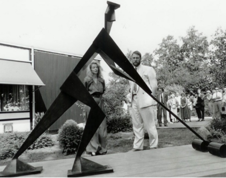
With her artist name Atelier 85, Ria Groenhof refers to her graduation in sculpture and environmental design from AKI ArtEZ in Enschede in 1985. Prismatic surfaces and acute angles have always formed the basis of her sculptures and paintings, which oscillate between figuration and abstraction. Fascinated by the visual power of simple structures and primary colors, the artist explores the diversity of design and meaning in abstract geometric art. In her early sculpture Balance (1988), she focuses on the complex relationship between forms and colors. The black and red forms are dependent on each other; only together do they develop a state of equilibrium. The calmness contrasts with the energetic and dynamic forms, which are reminiscent of the sensitivity of a balance.
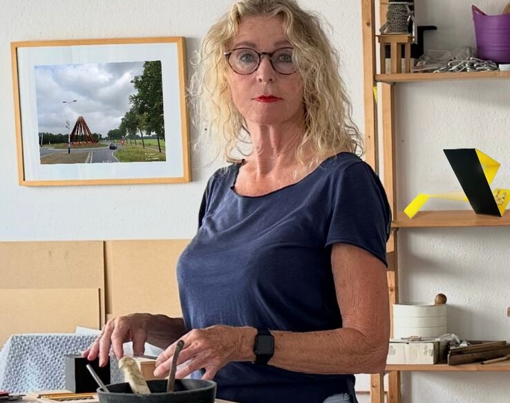
Ria Groenhof in her studio
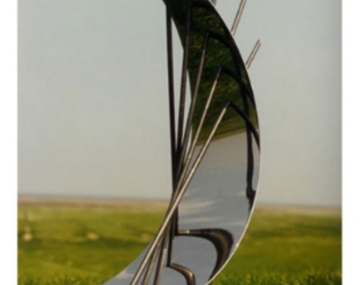
In the following works, Groenhof revisits themes she has already explored, but places the line above the surface. Trinity (1989) is a fragile-looking stainless steel structure that alludes to the close intertwining of past, present, and future. By dispensing with color, the surfaces appear to move due to refractions of light, emphasizing the fragility of the steel rods, which are positioned at acute angles to one another. Groenhof transfers elements from her paintings into the sculpture Trinity: in her works on canvas, she combines flat components in primary colors with fine lines that evoke architectural structures. They serve as symbols for constructs of time and memory. In the sculpture, they become a central design element just a few years after she began her artistic career.
In a work on transformation processes, Groenhof links the line with the surface: stainless steel rods intersect at a common point and form the center of the sculpture New Life (1995). The curved, flat element is oriented toward the given structure. It protectively surrounds the delicate junction from which the growth of new life and the comprehensive changes that accompany it radiate. New Life hints at an exploration of natural processes that would gain greater influence in the years to come.
Picture: Ria Groenhof: New Life (1995)
In transition: public commissions
Alongside her independent artworks, public commissions have also been an integral part of Groenhof's oeuvre for many years. One of her first was Turfsnijder (Peat Cutter) (1991) for the municipality of Heerenveen near her home in Lemmer. The artist depicts the physically demanding work of a dying profession in a reduced physicality: flat prisms emphasize the body pushing itself to its limits, almost like line structures. The worker, always with his head held high, forms a stable, triangular composition in combination with his tool, his livelihood. In Turfsnijder, cultural and economic upheavals are manifested in lively geometry.
Picture:
Ria Groenhof: Turfsnijder (Peat Cutter, 1991)
The work De Wachters (The Guards) (2000) was also created for the municipality of Heerenveen at the turn of the millennium. Three identical, 6.50 m high sculptures rest on a grassy peninsula and tower over their surroundings like lighthouses. They guard the boundary between land and water, where human habitation ends and nature begins. The sculptures consist of acute-angled surfaces, and the primacy of line in Groenhof's work is pushed into the background. The artist emphasizes the location-specific character of the sculpture group and its state between artificiality and naturalness through her expanded choice of materials: she uses Corten steel, which develops a deliberate layer of rust on its surface. This layer creates a unique look and highlights the creative influence of the environment on the sculpture.
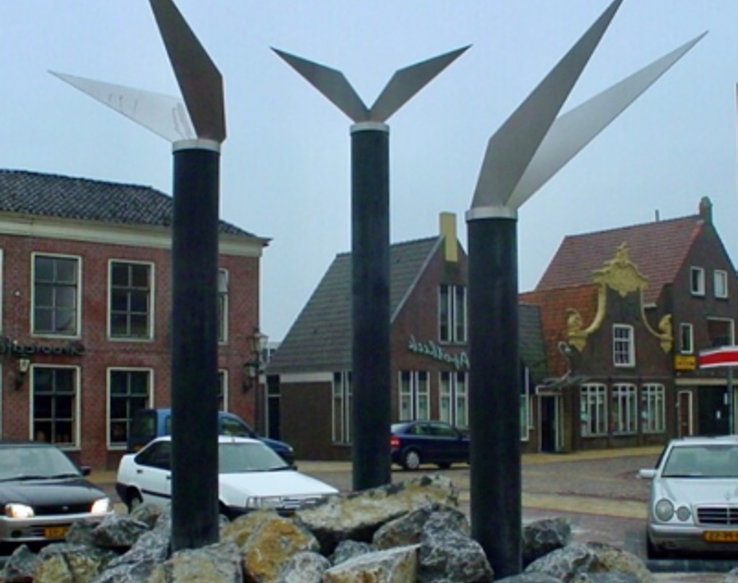
Groenhof's work De Grins fan Greide en Wetter (The Border Between Meadow and Water) (2002) on Fedde-Schurer-Square in Lemmer also deals with different habitats. Three black reinforced concrete pillars are topped with wing-like stainless steel structures symbolizing the land, water, and fishing. The stainless steel constructions feature the artist's signature acute-angled shape. Their lightness contrasts with the pillars, and their shape refers to the crossing of boundaries and unfolding, but also to sensitive systems. The artwork was inspired by a poem by the poet and politician Fedde Schurer, who grew up in the fishing village of Lemmer at the beginning of the 20th century.
Picture: Ria Groenhof: De Grins fan greide en wetter (2002)
In further works from the 2000s, Groenhof continues her combination of line and surface and also reintroduces primary colors into her work. De Hege Fonnen (2006), also on public display in Lemmer, features thin upright steel rods symbolizing the high pastures of the landscape. Hanging inside them are three circular surfaces, the visually central elements of the sculpture. On them are a clef, a ball, and an abstract figure, representing music, sports, and dance. Each disc is supported by five rods, which also represent the five senses with which humans perceive culture and nature. Groenhof's work Wall Relief (2004) combines steel surfaces in primary colors with reflective stainless steel surfaces. The latter are based on the shapes of crescent moons and stars. The round yellow surface, surrounded by a halo of light, represents the sun, while the acute-angled red and blue surfaces symbolize the spectrum of human color perception. This combination of colors with stainless steel surfaces, alternatively with black surfaces, has since set the tone for Groenhof's work. It finds its counterpart in the artist's paintings, which are closely related to Wall Relief and unfold primarily on a white background that emphasizes the depth effect.
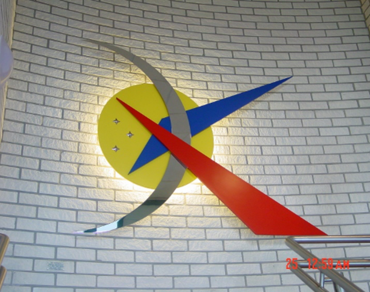
Picture:
Ria Groenhof: Wall relief (2004)
The natural sculpture
The stronger focus on nature, as seen in Wall Relief, continued and expanded during the 2010s: The basis of the walk-in installation Landscape (2013) is a flat, sand-covered floor from which thin pillars rise diagonally. They are reminiscent of tall grasses, similar to the structure in De Hege Fonnen. In the installation, they are rendered in primary colors as well as black, gray, and white, evoking the elemental forces of nature that create diverse life even on barren soil. In 2018, Groenhof was one of seven artists to take part in a land art project that is also closely connected to Dutch nature. In Ode aan M.C. Escher op 't Bildt, she designed a flat cornfield of around one hectare in size with her characteristic acute-angled shapes. The project was part of the program of the European Capital of Culture Leeuwarden.
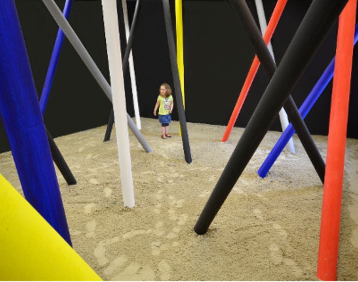
Picture:
Ria Groenhof: Landscape (2013), Installation
Groenhof's transition to land art is exceptional in this form, but the work is closely related to the general development of her art, in which the influence of nature has become increasingly important. In her most recent works, nature becomes a co-creator: Windroos (Compass Rose) (2020) varies Groenhof's formal and color language in new ways. In reference to the widespread everyday object, she combines a compass rose with a whirlwind: the red diamond indicates the direction of the wind. An irrigation device is integrated into the base of Windroos. The sculpture thus not only represents the close connection between art and nature, but also fulfills practical functions. The work Colors of the Wind (2024) presents an abstract design of whirlwinds. Here, three circular surfaces in red, yellow, and blue, each held by a black frame, are aligned by the wind. The artist transfers function into kinetic art.
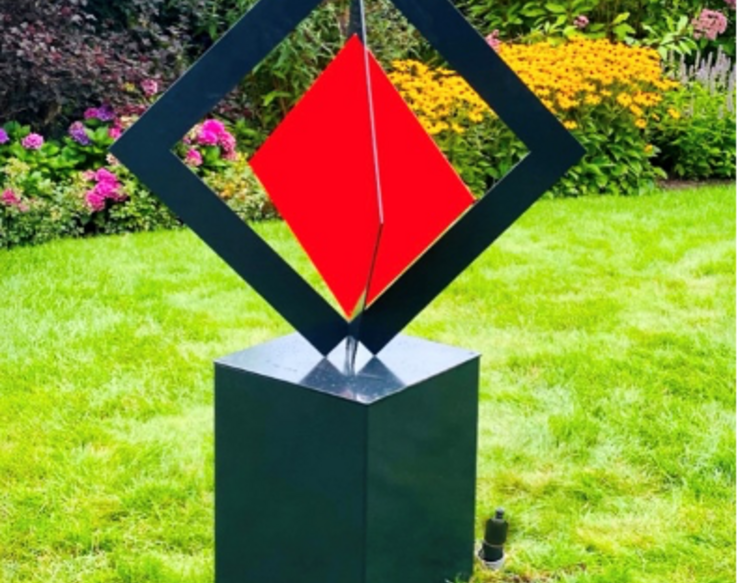
Picture:
Ria Groenhof: Windroos (2020)
The close connection between design and art, combined with a strong reference to nature, is particularly evident in Groenhof's garden furniture. It is characterized by colorful surfaces with sharp angles, sometimes combined with lines created by stainless steel rods. These objects, sculptural benches, are also handcrafted by the artist herself and are installed in public gardens and parks. Blue Wave (2021), for example, consists of black steel and a blue wooden seat. The meditative power of flowing water, which paradoxically can create moments of inner peace in people through its movement, is transferred to a unique seating arrangement. The composition is a dialogue between movement and stillness.
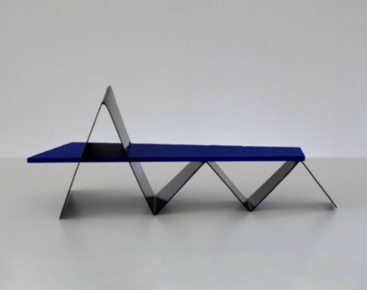
Picture:
Ria Groenhof: Blue Wave (2021), scale model
Yellow Star (2021), on the other hand, draws on the contemplative power of trees and the protection they offer: the sculptural object is designed like a four-pointed star with the tree at its center. As a life-giving symbol, the tree is integrated into the art object, which reflects the light necessary for plants and the growth associated with it through its form and color. The seats of the four benches near the trunk have a slight incline – in addition to their symbolic function, they are useful for people of different heights. Yellow Star is based on an early concept from 1995, which only found its final form more than 25 years later in the course of the general development of Groenhof's artistic work.
Over four decades, the artist's work has shown an intense engagement with geometric abstraction and its spatial effect, with her formal language becoming increasingly open: from strictly prismatic compositions to installation works with references to nature and functionality. However, precise order always remains the starting point for her designs. Groenhof uses minimal means to explore complex relationships between form, space, and perception. She succeeds in combining abstract geometry with an immediate, sensual experience.