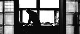
Photo: Lukas Meyer
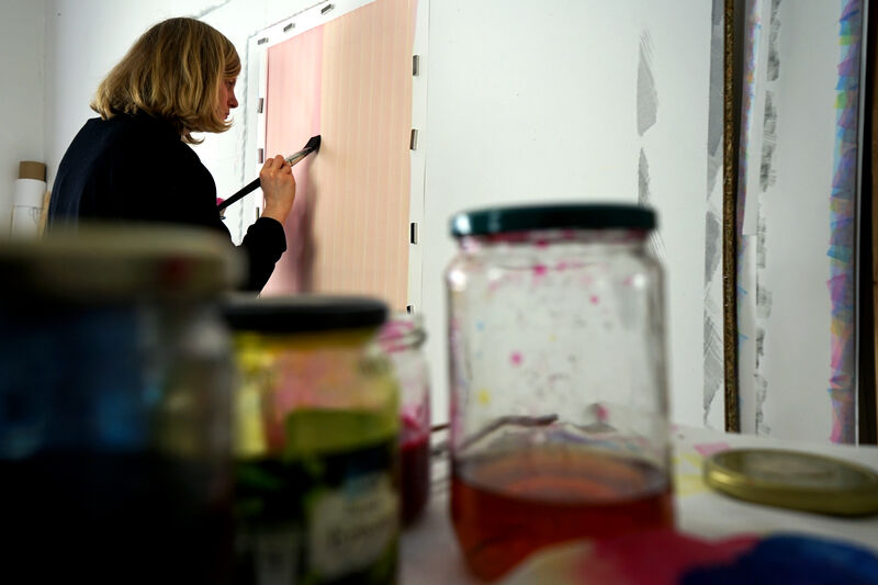
Luise von Rohden studio view


Luise von Rohden answers this question with a clear no, which is not really surprising, because her works are always reduced to a minimum. For her, the right balance between precision and irregularities is essential for a successful work, as she explains to us in conversation.
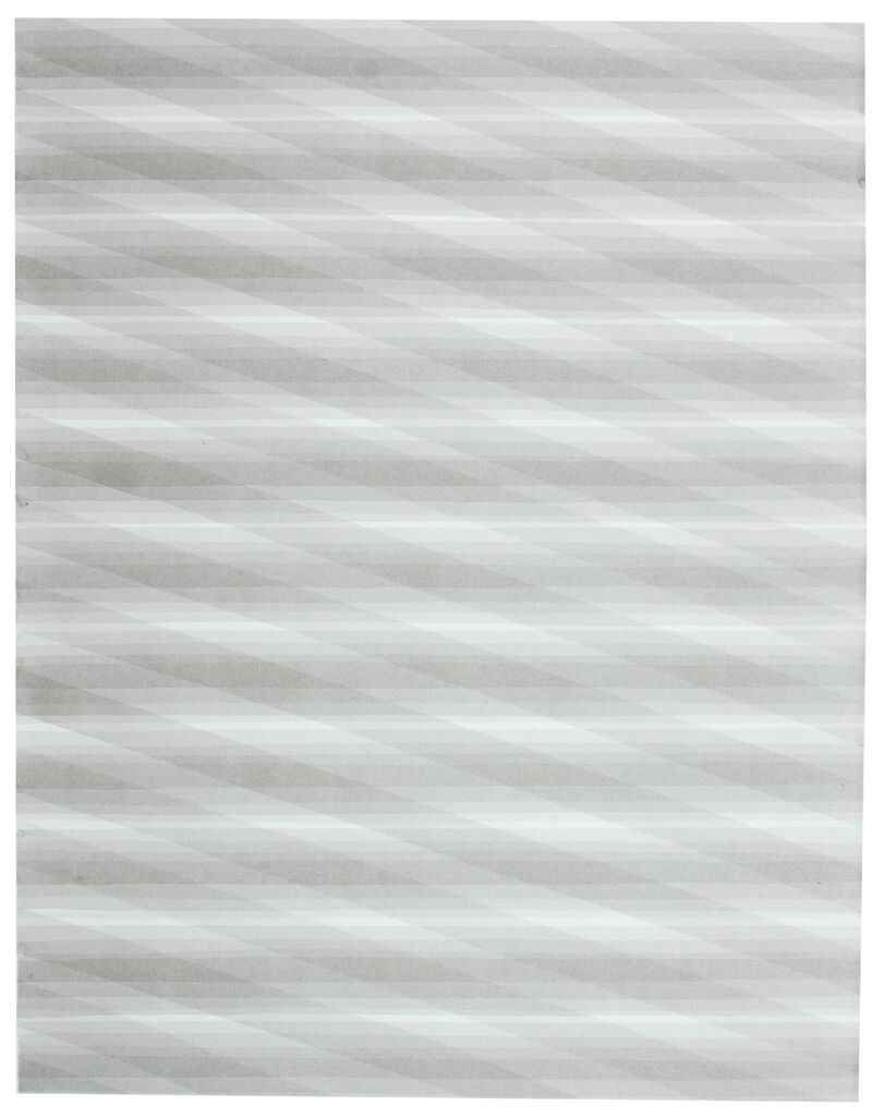
Von Rohden's ink works at first seem to follow a strongly geometric system and are thus reminiscent of the minimalists of the 1950s and 60s, but on closer inspection small differences in the lines become visible and the process of creation emerges. What appears to be made by machine or with tools is actually a manual process of numerous repetitions. One line after the other is applied by hand, one layer on top of the next. It is a contemplative production process that only becomes comprehensible upon close inspection of the works and is closely interwoven with the material. The artist creates multiple layers and overlaps with her transparent ink webs, thereby creating an impressive depth. By allowing for minimal imperfections, Luise von Rohden imbues her works with unexpected vibrancy while maintaining a high level of complexity.
Luise von Rohden was born in Gotha in 1990. She studied fine arts and art education at Burg Giebichenstein Kunsthochschule Halle from 2009 to 2015, where she worked as an artistic assistant until March 2022. During a stay in China in 2013/14, the artist, who since 2018 is also part of the collective Zusammenschluss für Raumfragen (ZfR), studied traditional Chinese ink painting. With her works she appropriates this centuries-old technique and translates it into today.
In my paintings, brush strokes come together to form a surface. Strokes and combinations of strokes are repeated for this purpose. Thus the picture builds up slowly during the painting process: One stroke follows another, layer is applied after layer.
My media and working tools have been ink, brush and paper for many years. Through repetition and limiting myself to certain means, I reduce my paintings: For most sheets I use only one brush at a time, often only one dilution level of ink. The resulting surface is always a rectangle ... Through this reduction, little things become more important: Tiny irregularities stand out and shape the image; for example, when the brush at one point does not quite transfer the ink to the paper or the paper has a slight irregularity in its structure, or the various traces left by the brush hairs when the brush stroke is applied and removed.
Ink, brush, paper and hand never play together completely evenly. At the same time, I try to work as precisely as possible. A successful painting keeps the balance between precision and small irregularities.
Repetition plays a big role in my whole way of working. So I often start by picking up from an existing series of images, varying them, or really just repeating something.
Sometimes I wonder what something would look like and then play it out. There are many beginnings on small sheets of paper that haven't led to anything yet. Often they lie around for a long time and at some point I throw them away. Some things stay in my head and only years later images emerge that tie in with them. For me, something has to happen that I suddenly see a possibility in it to develop and elaborate. The strokes have to become more than just strokes joined together. So, working on a new series of images happens while making something, looking at it during and after. When I see something in it, I continue. A glimpsed possibility is then worked out in the making, extracted and concentrated.
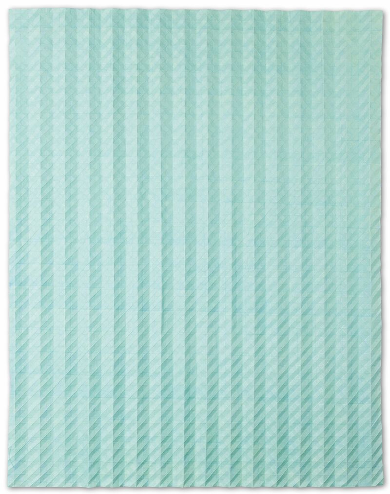
For many years I completely disregarded color and worked only with shades of gray - that is, black ink and water. Of course, the gray of the diluted ink already has a color nuance. In order to achieve other, for example, somewhat colder, bluer gray tones, colored inks have long been available for mixing in my studio.
For some time now, I have also been using colored inks as strong colors. I started by superimposing them on the paper in such a way that the final result is an almost gray surface.
I like to approach perfection and then fail again and again. For example, I have tried to dilute yellow, red, and blue ink so precisely matched that they really do result in gray when layered on top of each other. Sometimes it almost succeeded - but only when the images are viewed in daylight. Other light tones bring out different color casts.
Color is also created in my paintings through layering and transparency. The white of the paper always shines through the layers of color and thus plays an essential role.
For a long time I worked without strong colors and I used light gradations of gray tones. That was part of the reduction I was talking about. When I disregard possibilities and limit myself, I can dive deeper into the remaining possibilities. At best, my attention and later that of the viewer can focus all the more on what remains after the reduction.
I want my paintings to be precise and in no way arbitrary. My paintings and studio processes should develop an inherent logic without following rigid concepts. I think my approach to color is still pretty much in its infancy. Again and again I notice that a choice of color can very easily become arbitrary. That's why I've limited myself to gray for so long. "What can I achieve by using different colors?" That's a question I'm asking myself right now.
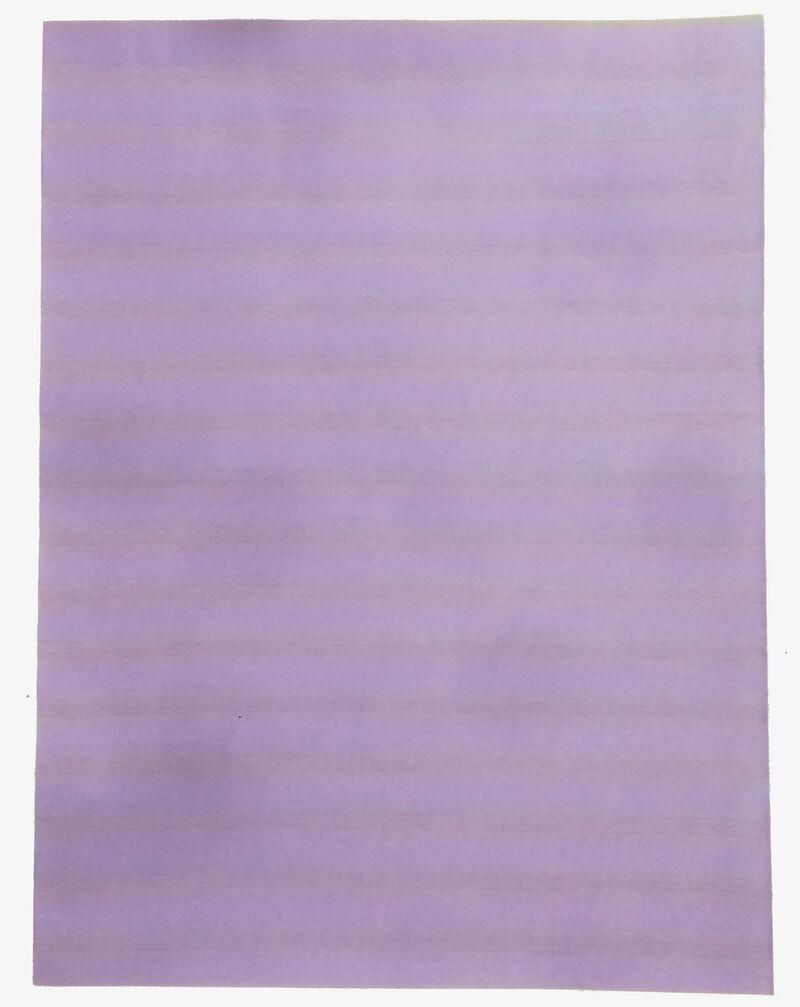
On the other hand, looking at the sheets that have already been created also plays a role here, and an intuitive seeing of possibilities. For example, when layering yellow, blue, and red ink on top of each other, a certain shade of purple excited me. The thin, strongly luminous lines seemed to be more light or visual error than actual material color. I wanted and want to continue working with this.
Color, like this purple, doesn't really begin to glow until it can stand out against another, adjacent hue. This is something I knew before and have seen in others' paintings. In my own painting process, however, I am just discovering it. In doing, I am currently approaching very basic factors of color and color vision. For example, that a color has a different effect depending on the neighboring color, and so I see color transitions where there are none. I hope that new series of paintings will develop from such simple observations.
Agnes Martin, Martin Assig's paintings, Bridget Riley - also her texts, interviews ... Enumerations of artists I appreciate and admire are written down so quickly. But so far it has been more like this: I have developed my artistic position - rather unconsciously shaped and influenced by many things (seen artistic works, read, strongly also influenced by people around me and conversations with them...). It is not that I see or read something and then think to myself "according to the concept I act now too". Rather, I develop an artistic work and the experience and confrontation made through this then perhaps makes the work of an artist, the attitude of an artist more accessible to me: Often someone else has succeeded in something that I myself am looking for. Or someone has said/written something in such a way that, while listening/reading, I suddenly found words for something not yet formulated before, or I question myself as an artist and my work.
I like very much that the daylight - its light mood, colorfulness, intensity - changes. I like the change more than a particular moment. ... I like rooms flooded with light and the mood of light when it's hot and bright outside at noon and inside the light falls into a room through bright curtains.
Visually, what popped into my head right away with your question: I like the colorfulness of the evening sky, when the sun has already set but the sky is still bright blue, fading into a narrow strip of green-yellow towards the horizon.
Name: Luise von Rohden
Year of birth: 1990
Place of birth: Gotha
Place of residence: Leipzig
Instagram: @luisevonrohden
Website: luisevonrohden.de
Gallery: artnow Gallery

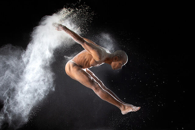
Bringing time to a standstill with photography: Berlin-based photographer Elitza Nanova not only captures the dynamics of dance, but also her fascination with fleeting moments for eternity. In an in-depth conversation, she provides deep insights into her practice. The interview was conducted by Mario Stumpfe.
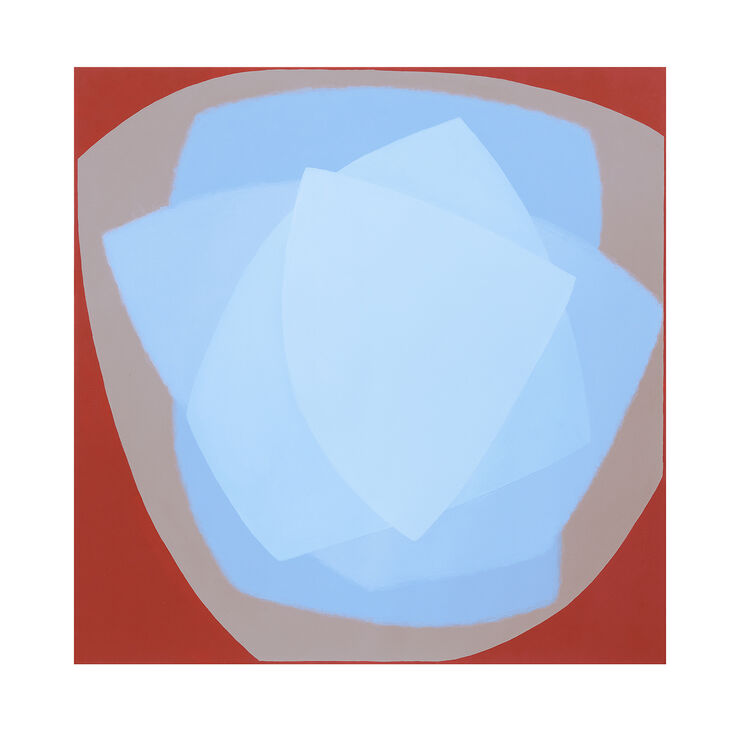
With her minimalist paintings, the artist Eveline Stauffer succeeds in capturing the expressive power of maximally reduced forms. We interviewed the artist on the occasion of the publication of her new limited edition fine art print of the work Light blue light in the south.
Art for the harmonious coexistence of the global population: At the Haus der Kunst in Munich, Argentine artist Tomás Saraceno presents visions for new forms of living together. The exhibition Tomás Saraceno. Ancestral Futures opens on July 17.
A unique body of work: Tate Modern is presenting the Cuban artist Ana Mendieta with over 150 works, including films, installations, and rarely seen paintings. The exhibition of the same name opens on July 15 in London.